
Project
Barro
Packaging
Labels
Refills
2025
The brief
Luísa Teixeira started Barro in 2016, mixing clay masks in the back room of her pharmacy in Bonfim. Fourteen products later the range is sold in 240 pharmacies across Portugal and online, and each product had been designed the year it launched, by whoever was free. On a pharmacy shelf it looked like a jumble sale: four logos, three typefaces, and the clay content, the one thing customers compare, hidden on the back. A fifteenth product was due in October 2025, and Barro wanted it to arrive into a range.
The idea
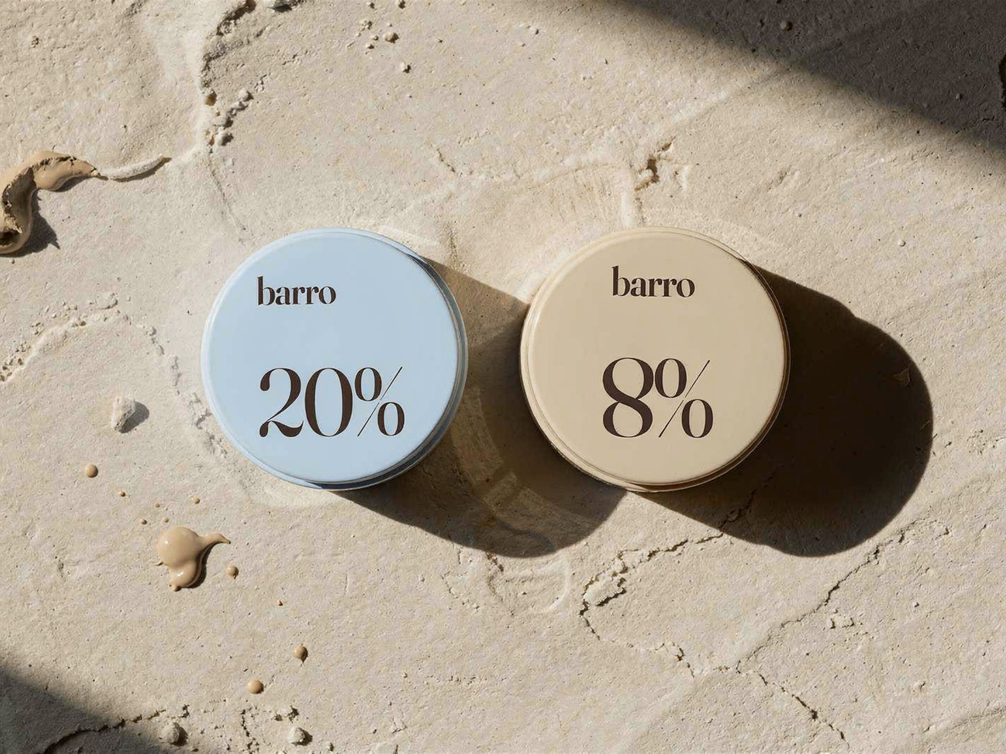
People in a pharmacy look for their skin type first and the ingredient second, so the packs do it in that order. Each skin type has one pale colour, printed as a flat tint over the whole pack: sage for oily, rose for sensitive, sky blue for dry and bone for every skin. From across the shop a customer finds her colour, then reads the clay content set large on the front, 30% white clay or 12% pink clay. Amber glass is kept for oils and serums, which light spoils.
Jars and tubes
Jars and tubes in the four tints, with the name in lower case and the clay percentage on the front and the lid, set in Fraunces. Ingredients sit small on a pale band at the back, so a jar turned around is just a good pot.



Amber glass
Serums, oils and the cleanser in 30 ml amber glass, with paper labels in the same layout printed on a wet-strength stock that survives a year of bathroom steam. On glass the skin tint moves to a band across the top of the label.


Boxes and refills
Outer boxes on 350 gsm board repeat the label at full size with the batch and every ingredient, so a pharmacist stocking a shelf can read the skin type from the end of the aisle. A spouted refill pouch for the three bestselling creams lets the jar stay in the bathroom.


What changed
The fifteenth product, a pink clay mask for sensitive skin, launched in October 2025 straight into the rose. Barro’s fourteen labels are ganged on two press sheets, so adding it meant one new tint and a name rather than a new design, and pharmacies began giving the range a shelf of its own instead of three places on three shelves.
Credits
Okapi: Ana Pires (lead designer, packaging), Tomás Reis (design director), Marta Lobo (labels)
Barro: Luísa Teixeira (founder), Carla Mendes (marketing)
With: labels printed in Porto on wet-strength paper; product photography by Teresa Lima, Porto

