
Project
Kopje
Identity
Packaging
Menus
2026
The brief
Kopje opened in 2023 on the Kraanlei in the Patershol: one counter, eleven stools and a queue from seven. By 2025 it was pouring around 400 drinks a day, a third of them matcha, and selling out by noon. Every cup was plain white. Regulars posted their drinks and tagged the café next door, and newcomers asked the staff what the place was called. The owners had six weeks before their next cup order went to the supplier, and a second bar signing in the spring.
The idea
Order by colour. Standing at the counter, nobody remembered the names on the board, but everyone remembered “the pink one”. So every drink got a colour and its cup is printed in it: matcha green, hibiscus pink, mandarin for the espresso tonic, sky blue for the oat flat white. The menu lists drinks as colour dots, and the o in the wordmark is a cup seen from above.

Hot cups
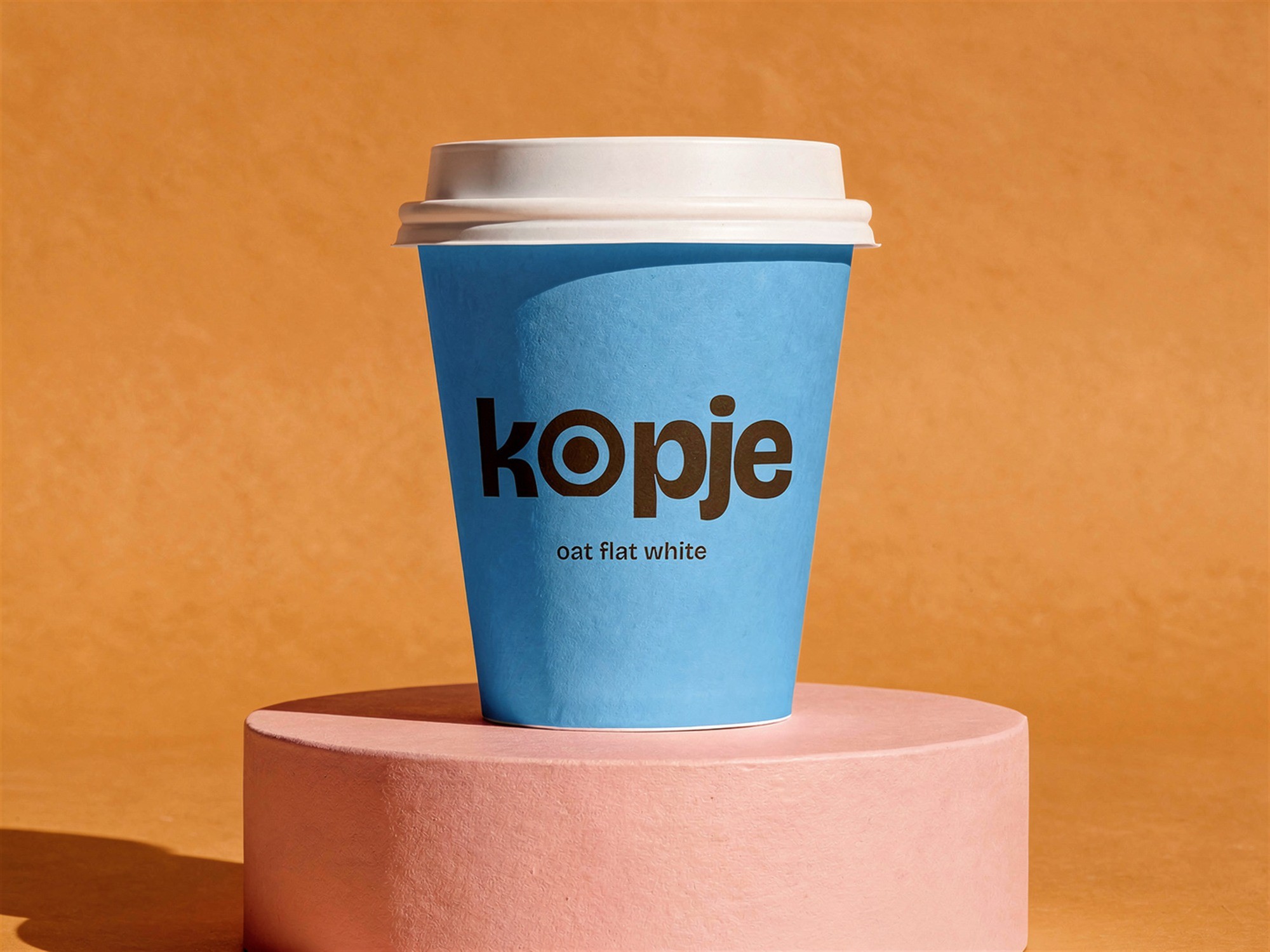
Double-walled stock cups, each printed all over in its drink's colour: sky for the oat flat white, pink for the hibiscus latte. The wordmark sits in espresso brown with the drink's name under it, so the cup itself is the order ticket.

Cold cups
Clear cups with dome lids for iced matcha and the espresso tonic, printed in white only, so the drink supplies the colour. These are the drinks people photograph, so the wordmark is set large.


Carrier, bag and menu
A four-cup carrier in mandarin with the wordmark on the handle panel, a pink bag for pastries and a menu card that lists every drink as a colour dot, in the same order as the cups on the counter.

Around the bar
The colours carry past the cups: a loyalty card where you collect one of each and the fifth is free, the hours on the window, a bag of the house beans, napkins in every drink colour, and the tote and aprons the staff wear behind the counter.


What changed
The new cups went out on 2 February 2026. The second bar opened near Sint-Pieters in May with the same kit and no new design work, and customers now tag the right account. Most orders at the counter now start with a colour.
Credits
Okapi: Tomás Reis (lead designer), Ana Pires (packaging), Marta Lobo (menu and drink names)
Kopje: Joana Ferreira (co-owner), Martim Almeida (co-owner)
With: cups and carriers printed by a packaging supplier in Kortrijk; photography by Carlota Amaral, Ghent

